Case · Planet Huse
Same message.
New planet.
Planet Huse has built architect-designed holiday homes since 1988, from its own factory in Ribe. We made their display campaign. When the brand moved to a new logo and identity, we redrew the whole campaign: the same words, a new look.
Start your project
1988
building holiday homes
6
display formats
2 × 4 s
animated rotation
1
message in every format
The brief
The campaign worked. The logo had changed.
The campaign was built around one sentence: architect-designed holiday homes, and a promise to draw your dream. Since then Planet Huse has moved to a new identity with a navy wordmark, a ringed planet and a mint accent. The task was to keep the message and give it the new look.
The same words
“Arkitekttegnede fritidshuse. Vi tegner jeres drøm af et fritidshus!” The headline and both model frames are unchanged, word for word.
New colours
The green panel is now navy, with mint for the button and the orbit line. Sand replaces the white logo corner.
A shape from the logo
The curved panels and the thin line across the photo come from the ring around the planet in the logo.
A clear next step
Every format now ends in the same mint button: Se husene.
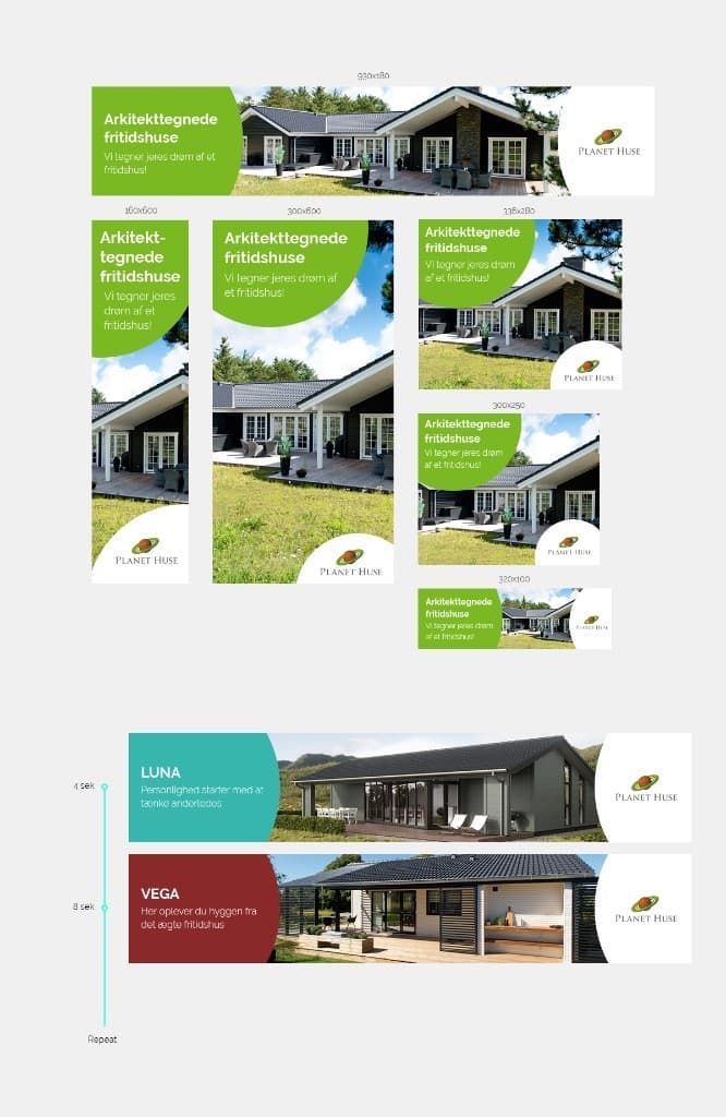
Before
After
The identity
Navy, mint and a planet with a ring.
We built the banners from Planet Huse’s current brand: the wordmark, Montserrat and a small palette, used the same way in every format.
Navy
#061E3F
Panels and text
Mint
#02EFB3
Button and orbit line
Sand
#F0EFED
Logo corner
White
#FFFFFF
Text on navy
Montserrat
Aa
Arkitekttegnede fritidshuse
Vi tegner jeres drøm af et fritidshus!
ExtraBold for the headline, Medium for the line under it. The same typeface as planet-huse.dk.
The orbit
Every panel edge follows an ellipse, and a thin line traces it across the photo, like the ring around the planet in the logo.
Six formats
One system, from 930 × 180 to 320 × 100.
Each format gets its own layout: a side panel in the wide ones, a top panel in the tall ones and a corner in the boxes. The photo is cropped for each, so the house never sits behind the text.
Top banner
930 × 180
Skyscraper
160 × 600
Half page
300 × 600
Large rectangle
336 × 280
Medium rectangle
300 × 250
Mobile banner
320 × 100
Animation
Two houses, four seconds each.
The animated version rotates between two models, Luna and Vega. The panel slides in, the orbit line draws itself along the curve and the photo slowly settles. After eight seconds it starts again.
4 s · LUNA
8 s · VEGA
With reduced motion turned on, the banner shows the first frame and holds still.
On the web
Next to the articles about houses.
The top banner and the half page on a lifestyle site. The top banner runs the animated rotation, and the half page holds still next to the article.
On the phone
In the article, at the bottom and in the story.
On a mobile site the medium rectangle sits between paragraphs and the mobile banner stays at the bottom. On social the two model frames become a story, and the box becomes a square post.
Mobile site
Story
Feed
Outdoors
The same poster at the bus stop.
The half page scales up to a bus shelter poster without a new layout. The navy panel reads from across the street, and the mint line catches the eye.
What we delivered
The whole campaign in the new identity.
- 01Six display formats, from 930 × 180 to 320 × 100
- 02Animated rotation with two models, four seconds each
- 03A layout system built from the new logo
- 04Photo crops for every format
- 05Story and square post for social
- 06Poster version for outdoor
Need a campaign that looks like your brand?
We design ads, animations and the brand work behind them, from one banner to a full campaign.