Case · Brand identity
Imbro Ejendomsinvestering. A brand with solid foundations.
Imbro invests in Danish property on behalf of private and professional investors. We designed the brand identity: a mark drawn from two interlocking halves, a palette taken from brick, limestone and brass, and a system that holds together from the favicon to the site sign.
2.7bn
DKK property portfolio
20+
years in property
8
specialists behind the brand
1
identity across every touchpoint
The brief
Trust has to be visible before the first number is read.
Imbro asks investors to place serious money in buildings they may never visit. The identity had to feel as solid as the properties themselves, calm, precise and Danish, without looking like a bank.
Solid, not stiff
A mark with the weight of masonry, but with movement in it, so it reads as a partner rather than an institution.
Built for prospectuses
Every project gets its own prospectus, sign and campaign. The system had to make each one feel like Imbro without redesigning anything.
Small to large
The same mark has to work at 16 pixels in a browser tab and at three metres on a construction site.
The mark
Two halves. One structure.
The Imbro mark is two identical shapes that lock into each other, offset along a single axis. One half is the investor, the other is Imbro. Neither stands on its own. Together they form a closed, load-bearing figure, like two walls meeting at a corner.
2
identical halves
53°
the angle of every edge
33.3
units of offset between the diamonds
Architecture drawings
We drew the logo like an architect would.
An identity for a property company should hold up to the same scrutiny as a building. So we put the mark on the drawing board: its construction, and the same shape read as a floor plan.
Construction
Two equal diamonds, offset by 33.3 units along the horizontal axis. Every edge runs at the same 53° angle, and each end cap is a 9.4 unit circle.
- Scale
- 1:1
- Grid
- 4 u
- Rev.
- A
Floor plan
Read as a plan, the mark becomes rooms: the investor, Imbro and the shared space in between. The four openings are doorways, always open in both directions.
- Scale
- 1:50
- Level
- 00
- Rev.
- B
Colour
A palette taken from the buildings.
Corporate blue carries the brand. Around it sit the materials Imbro invests in: brick, limestone and brass, plus a paper white that keeps documents light. Click a colour to copy it.
Proportions in use
Typography
A classic serif for the name. A clean sans for the numbers.
Fjord One carries the tagline in the logo, so it also sets the headlines. Geist handles body text, tables and key figures, where clarity matters more than character.
Display · Headlines · Tagline
Fjord One
Aa
We love bricks, and we look after them with care.
ABCDEFGHIJKLMNOPQRSTUVWXYZÆØÅ abcdefghijklmnopqrstuvwxyzæøå 0123456789
Text · Tables · Key figures
Geist
Aa
Expected return 6.14 % p.a. Minimum investment DKK 750,750. Clear numbers, set in a typeface that never gets in the way.
Logo system
One logo. Every surface.
The logo is never redrawn, restacked or recoloured outside the palette. It is placed. These are the approved combinations.
Primary · Blue on paper
Inverse · White on blue
Premium · Brass on midnight
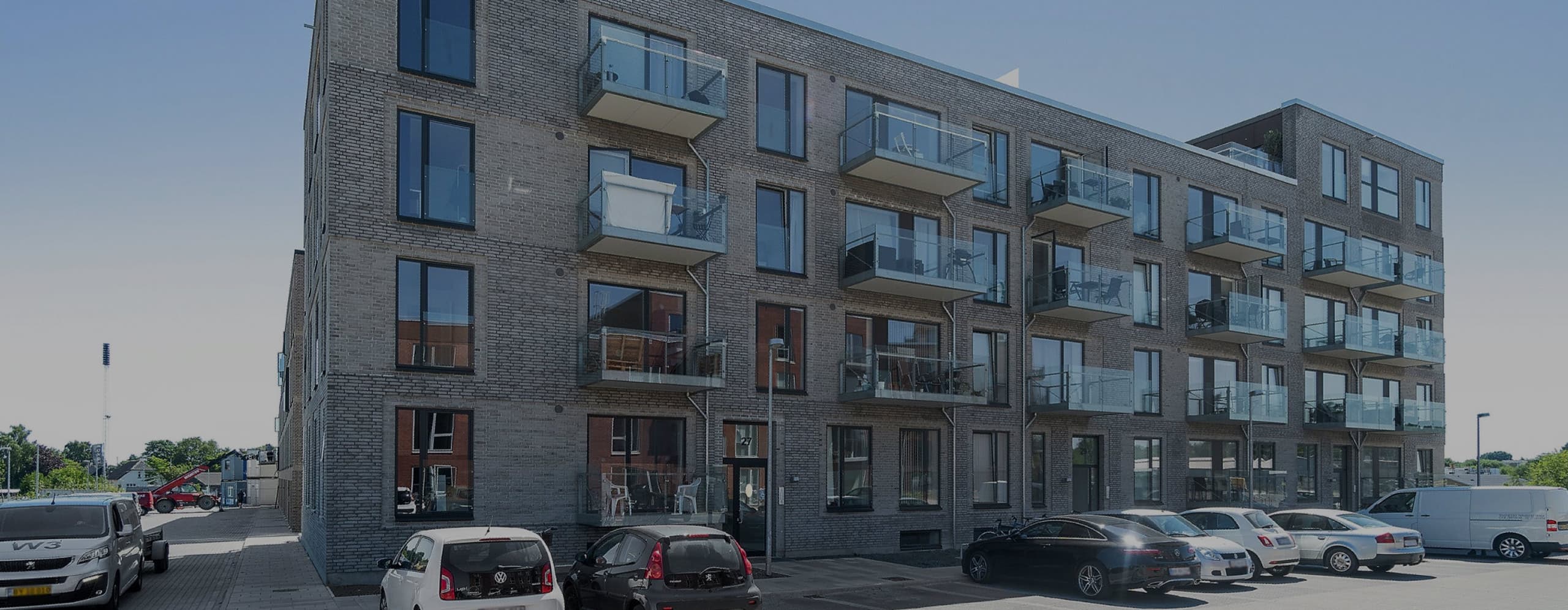
On photography
On limestone
Monochrome
Clear space
Room to breathe
The clear space x equals the offset between the two diamonds in the mark. Nothing may enter that zone: no text, no edges, no other logos.
Minimum size · print
25 mm
Minimum size · screen
120 px
Mark alone · from
16 px
The icon
The mark works on its own.
Where the full logo does not fit, the mark takes over: in browser tabs, on phones, as a profile picture, as a seal and as a pattern.
Favicon
Tested in light and dark browsers, and sharp from 16 px and up.
Favicon · Touch icon · PWA
App icon
For the investor portal on the home screen.
Profile picture
LinkedIn, newsletters and the investor portal.
Imbro A/S
Ejendomsinvestering · Aarhus
Seal
Brass foil for prospectuses, certificates and gifts.
Pattern
The mark as a surface, for backgrounds, hoardings and packaging.
Brand in use
From the business card to the construction site.
We designed the key touchpoints so every new project starts from a finished system, not a blank page.
Business card · 85 × 55 mm
Investment prospectus · A4

Investment prospectus
Imbro Vækst Dragør
Residential property with long-term growth, close to Copenhagen.
Return
5.62 %
Type
Residential
Status
Subscribed
Site sign · 3000 × 1500 mm
Imbro is building here
New homes in Risskov
imbro.dk
Letterhead · A4
Aarhus, 28 September 2026
Dear investor,
Thank you for your interest in Imbro Retail Hillerød. Enclosed you will find the prospectus and the key figures for the project.
We invest in properties we would own ourselves, and we are always ready to walk you through the numbers in person.
Kind regards
Lars Thomsen
Imbro A/S · Store Torv 7, 1. · 8000 Aarhus C · CVR 38395793
Social post · 1:1
Imbro A/S
2 h
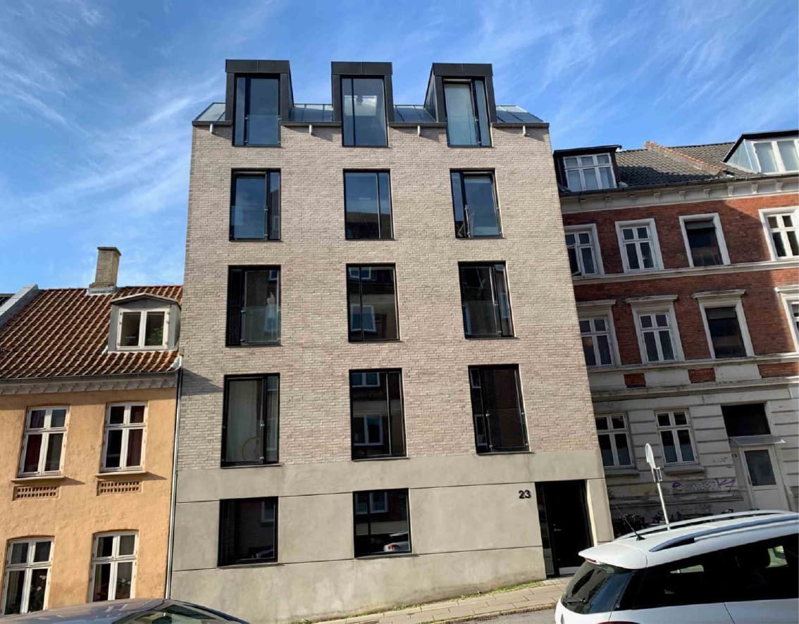
New project
Imbro Retail Hillerød
Expected return of 6.14 % p.a. Read the prospectus.
Read moreEmail signature
Kind regards,
Lars Thomsen
Director · Partner
+45 5353 6582 · lt@imbro.dk
Store Torv 7, 1. · 8000 Aarhus C
Website
Property investment
Solid property. Personal partnership.
For more than 20 years we have invested in Danish property, and we do it side by side with our investors.
2.7bn
DKK under management
20+
years of experience
6.14 %
expected return, Hillerød
Moods
Three moods, one brand.
The moods set the direction for photography, campaigns and prospectuses. They are different in temperature, but always recognisably Imbro.
Mood 01
Brick & brass
Craftsmanship you can touch. Warm, heavy and made to last.
Mood 02
Coast & calm
Space, light and patience. The long view on property.
Mood 03
Nordic dusk
When the lights come on, the building shows its value.
Motion
The mark comes alive, and always lands on the logo.
Four animations built for web, video and the investor portal. Each one ends on the untouched logo.
01
Draw
The outline is traced like a pen on a drawing, then fills.
Intros and video end cards
02
Interlock
The two halves slide in from opposite corners and lock together.
Page transitions and presentations
03
Loader
A light runs along the outline while the mark stays whole.
Loading states in the portal
04
Pattern
A slow wave moves across a field of marks.
Backgrounds, screens and hoardings
What the client says
“Ceptiv understood from day one that we sell trust before we sell property. The new identity gives us a calm and solid expression that works just as well on a prospectus as on a construction site. Our investors noticed it straight away.”
Lars Thomsen
Director & Partner, Imbro A/S
What we delivered
A complete identity, ready to build on.
- 01Brand strategy and positioning
- 02Logo presentation and construction
- 03Colour palette and typography
- 04Icon, favicon and app icon
- 05Pattern and seal
- 06Business cards and letterhead
- 07Prospectus template
- 08Site sign and hoardings
- 09Social media templates
- 10Email signature
- 11Motion and animation
- 12Brand guidelines
Does your brand look as solid as your business?
We build identities that hold up from the first sketch to the construction site. Tell us about your company.