Brand & design system · v2.0
Ceptiv, refined.
One identity for everything we make: the website, proposals, social posts, slides and the products we design for clients. The logo stays recognisable. Around it we built a sharper palette, a new headline typeface, a graphic language drawn from the spiral, and templates you can edit and download right here.
8
core colours
77
colour tokens
7
graphic systems
13
banner formats
01 · Essence
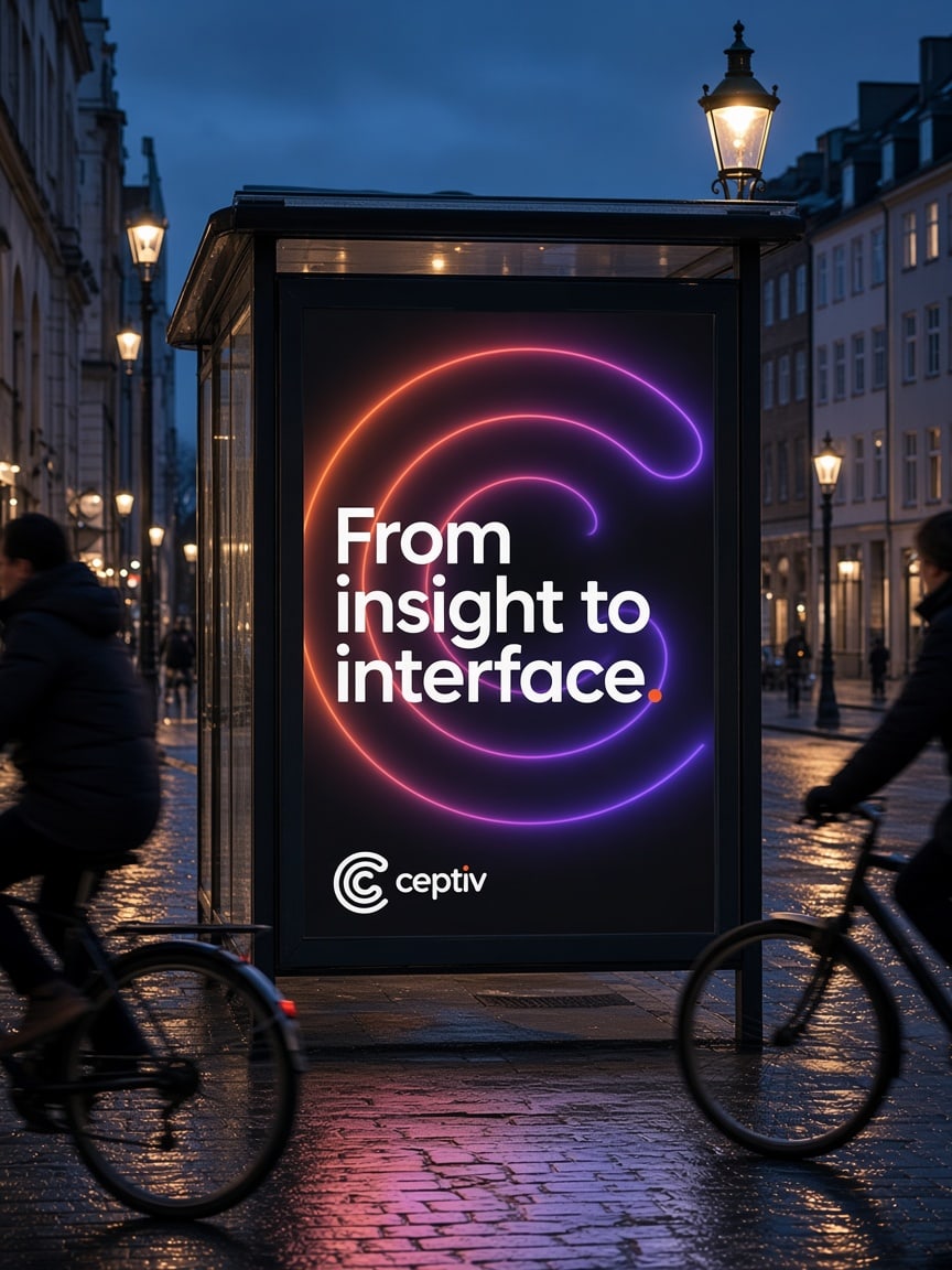
From insight to interface.
Ceptiv is a design and development studio. We start with the people who will use the product, turn what we learn into interfaces and identities, and then build them. Research, UX/UI, brand and code in one team, so nothing gets lost between the steps.
Curious
We ask before we draw. Interviews, field visits and data come first, opinions second.
Crafted
Details are the product. Spacing, wording and states get the same care as the big idea.
Clear
Plain language, fixed prices and interfaces that explain themselves.
Committed
We stay. Many of our clients have worked with us for years, across many projects.
How we sound
Say it plainly
Do: We interview your users before we design anything.
Don’t: We leverage user-centric methodologies to ideate.
Be specific
Do: Quote within 24 hours. Fixed price.
Don’t: Fast turnaround at a competitive price point.
Warm, not cute
Do: Tell us what is hard today. We like hard.
Don’t: Let’s make magic happen together!! ✨
Personality
02 · Logo
The same spiral, sharpened.
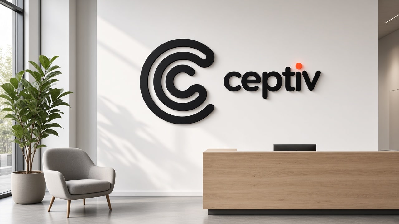
We kept the mark and the wordmark and fixed what held them back on screens: a wordmark that got too small next to the spiral, a flat black-only palette and no rules for how to use it.
Balanced lockup
The wordmark is 22 % larger and optically centred on the spiral, so it stays readable in the 24 px navigation bar.
The spark
The dot on the i is now a perfect circle in Signal. It is our smallest brand element and shows up across the system.
App icon
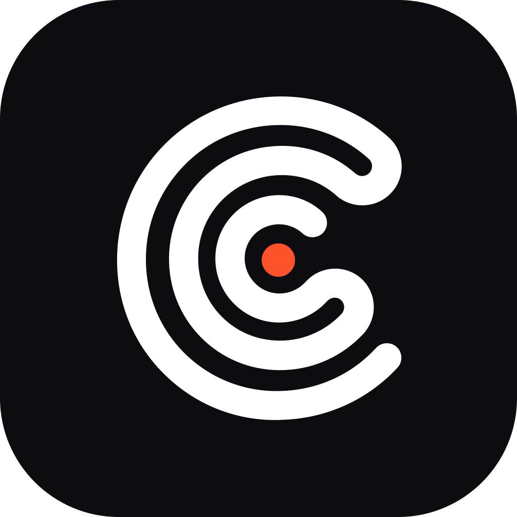
A new rounded icon puts the spark at the centre of the spiral, for favicons, apps and avatars.
Code, not a file
The logo is now an inline SVG component. It is sharp at any size, loads with the page and cannot go missing.
Construction
The spiral is three nested arcs that open to the right, like a C that keeps going. The wordmark’s x-height centres on the spiral’s core.
Clear space
Keep free space around the logo equal to the height of the “c” in the wordmark, marked x.
Minimum size
Horizontal logo 80 px / 20 mm wide. Mark alone 16 px / 5 mm.
80 px
16 px
Lockups
Colour variants
Ink on Paper
White on Ink
White on Signal
Mono
Please don’t
Stretch or squash it
Rotate it
Recolour the spiral in several colours
Add shadows or effects
Place it on busy photos without a backing
Rebuild the wordmark in another font
03 · Colour
Ink and paper, lit by a signal.
Most surfaces are Ink or Paper. Signal is the accent: one per view, on the thing we want you to notice. Iris adds depth for gradients and illustration, and the support colours carry status and data. Every ramp is built in OKLCH, so the same step has the same weight across hues.
Proportion
Roughly 60 % Ink or Paper, 30 % Graphite, 10 % accents. Signal rarely takes more than 5 %.
Full ramps
Click any swatch to copy its hex value. The number shows its contrast against white or ink.
Signal
Iris
Mint
Saffron
Lagoon
Graphite
Paper
Accessible pairings
Contrast ratios for the pairs we use most. AA needs 4.5 for body text and 3 for large text.
Gradients
04 · Typography
A headline face with character.
Bricolage Grotesque replaces bold Geist for headlines. It is a grotesque with slightly quirky details and optical sizes, so it looks tight in big headlines and stays readable small. Geist stays for UI and body text, Geist Mono labels data, and Instrument Serif italic adds the occasional expressive word.
Display & headlines
Bricolage Grotesque
Aa
Research that changes decisions
Headlines, big numbers, banners. 600–700, tight tracking.
Quick brown foxes jump over lazy dogs. Æble, øl og å.
Text & interface
Geist
Aa
Body copy, UI, buttons, forms. 400–600.
Quick brown foxes jump over lazy dogs. Æble, øl og å.
Labels & data
Geist Mono
Aa
Kickers, metadata, code and numbers. Uppercase with wide tracking.
Quick brown foxes jump over lazy dogs. Æble, øl og å.
Accent
Instrument Serif
Aa
One or two words in italic, in Signal. Never whole sentences.
Quick brown foxes jump over lazy dogs. Æble, øl og å.
Type scale
display · 88/84
Research that changes decisions
h1 · 64/64
Research that changes decisions
h2 · 44/46
Research that changes decisions
h3 · 28/32
Research that changes decisions
lead · 20/31
Research that changes decisions
body · 16/26
Research that changes decisions
small · 14/21
Research that changes decisions
label · 12/16
Case · Grundfos iGRID
05 · Tokens
The system, in numbers.
Spacing, radii, elevation and motion are shared between the website, client portals and design files. Export them as CSS variables or JSON.
Spacing · 4 px base
Corner radius
xs · 6
sm · 10
md · 14
lg · 20
xl · 28
pill · ∞
Elevation
hairline
lift
float
glow
Motion
Hover to play:root {
--ceptiv-ink: #0d0d11;
--ceptiv-paper: #f6f5f1;
--ceptiv-signal-50: #fff4f2;
--ceptiv-signal-100: #ffe7e1;
--ceptiv-signal-200: #fed0c5;
--ceptiv-signal-300: #feb19f;
--ceptiv-signal-400: #fe8a6f;
--ceptiv-signal-500: #ff532b;
--ceptiv-signal-600: #df390c;
--ceptiv-signal-700: #ba2a00;
--ceptiv-signal-800: #941e00;
--ceptiv-signal-900: #701400;
--ceptiv-signal-950: #4a0800;
…Tailwind classes
bg-ink  bg-paper  text-signal-500  bg-signal-500  hover:bg-signal-600
bg-iris-600  text-graphite-600  ring-mint-500  font-display  font-serif italic
06 · Components
Built from the same parts.
The core components, styled with the new tokens. They already work in the codebase through Tailwind classes such as bg-signal-500 and font-display.
Buttons
Tags & status
Inputs
What do you need?
Cards
Complex made simple
Research-led interfaces for portals, dashboards and apps.
40+
integrations ready to use
They move fast and never lose sight of the customer.
Lead Global Product Manager, Grundfos
07 · Graphic language
Mood and identity graphics.
Seven graphic systems drawn from the spiral and the spark. They are generated in code, so they scale to any format without losing detail. Choose a colour theme and download each one as SVG or PNG for slides, documents and social posts.
Theme
Orbit
The spiral outline echoed at four sizes. Hero images and covers.
Signal field
A dot grid with a spiral arm running through it. Data and tech topics.
Contours
Nested C-arcs in the rhythm of the mark. Section dividers, corners.
Aura
Soft light in Signal, Iris and Saffron with a fine grain. Mood and backgrounds.
Blueprint
Grid, construction circles and the mark. Process and research content.
Spark
The spark with its orbits. Announcements and quotes.
Pattern
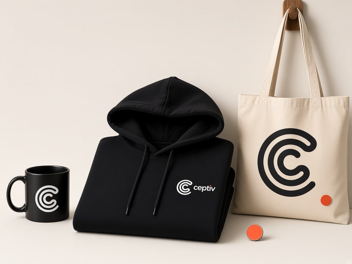
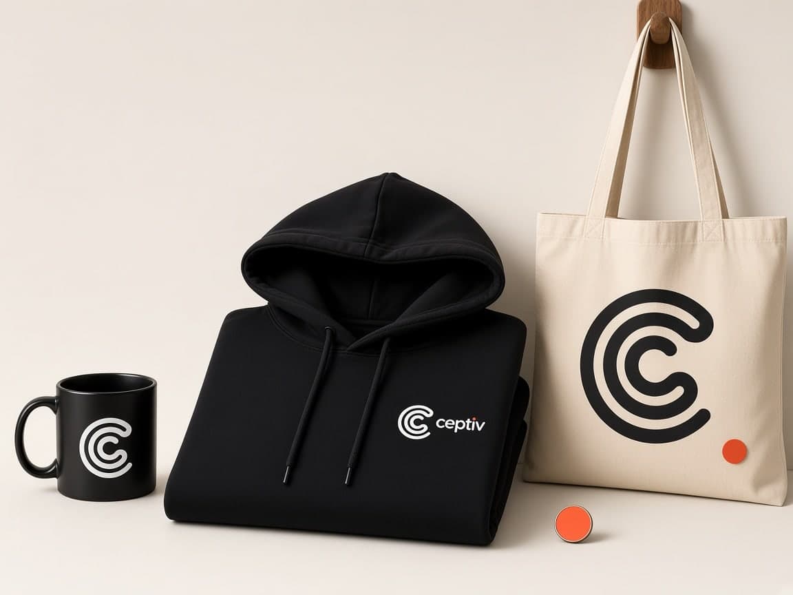
The mark as a repeat. Merchandise, packaging and wallpaper.
09 · Stationery & documents
Material for everyday work.
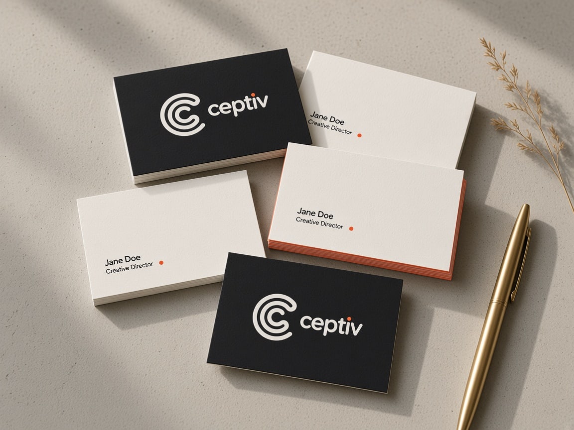
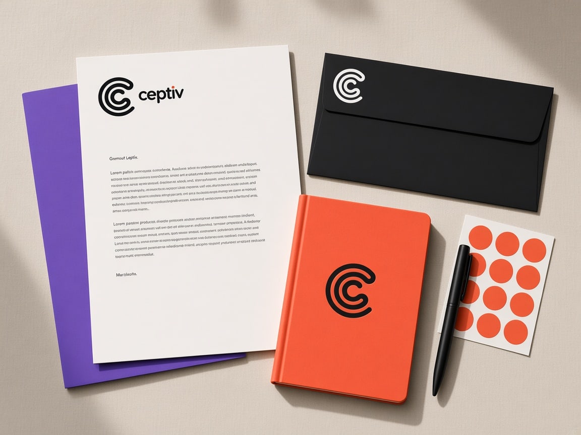
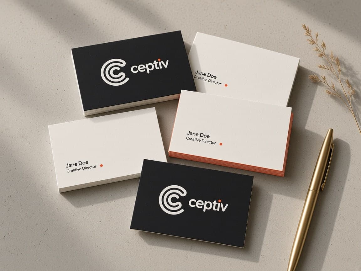
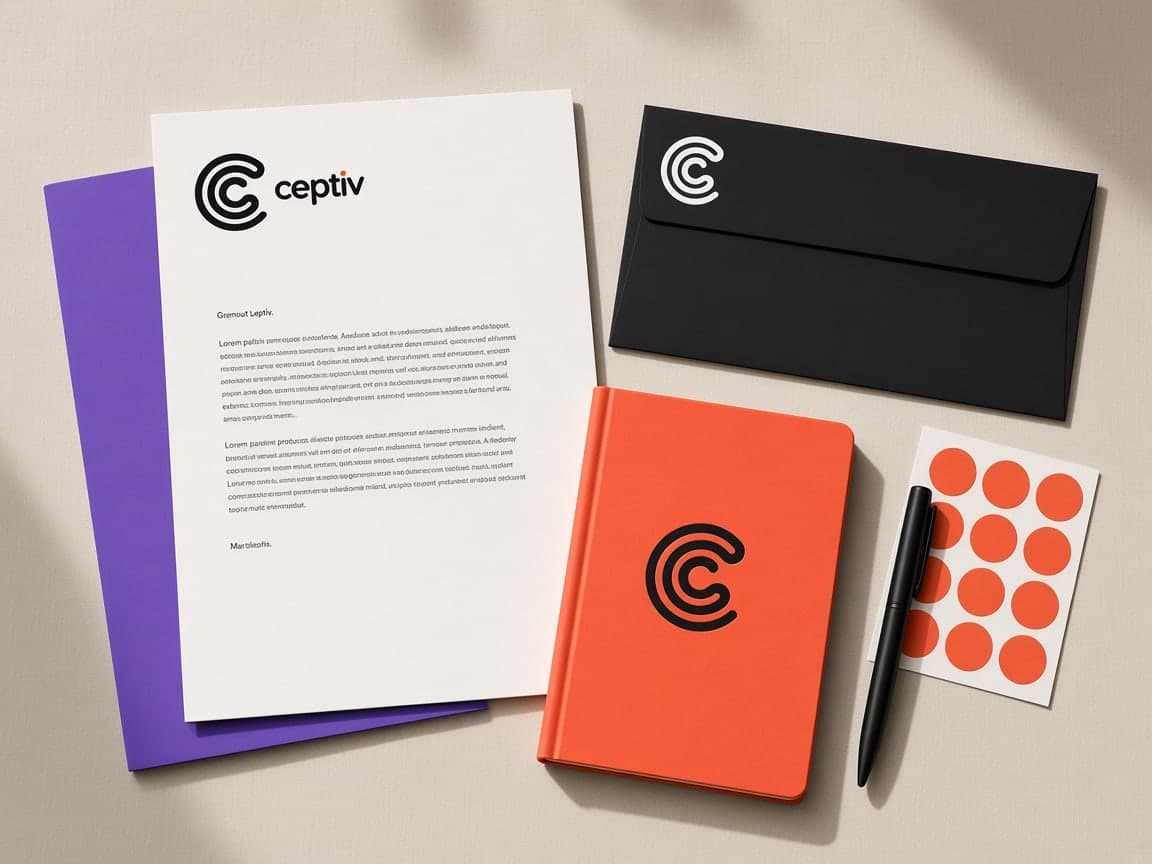
Business cards, letterhead, proposal covers, slides and an email signature. Edit the fields and download print-ready files.
Business card · 85 × 55 mm
Letterhead · A4
Proposal cover · A4
Presentation · 16:9
Email signature
Copy the HTML and paste it into Outlook, Apple Mail or Gmail.
|
Your Name
Senior UX/UI Designer
ceptiv.net From insight to interface.
|
11 · Downloads
Everything in one place.
Logo kit
SVG and PNG, all lockups and colours
App icon
Ink, Signal and Paper, 1024 px
Fonts
Free on Google Fonts
Design tokens
CSS variables and JSON
Logo files
Every lockup in five colour versions, as SVG for screens and print and PNG at 2000 px.
Want a brand system like this?
We design visual identities and design systems for companies that want to look as good as they work.